This exercise extended the use of colour in observational drawing. The course notes suggested that low key subjects are explored using colour that is non-representational. I think that this could also apply to high key subjects, such as white orchids. It was also suggested that oil pastels could be used to create wax resists for colour washes.
Initially, I tried to create a wax resist using candle wax, and then build up layers, adding wax and further washes, alternately. This was not very successful because the colours that I used initially were too dark for subtle changes in tone and also because I became impatient waiting for washes to dry. I used (A3) water colour paper because I had thought that this would produce added textural effects but, with a wax resist, it is difficult to get any clean lines which, when combined with impatience and inappropriate colour choices, results in a mess. Because this is a warts-and-all learning log, I reproduce the evidence of my first two attempts at this below. When the wax resist did not produce the intended effect, I scribbled over the surface using Art Bars. The result is more frustration (expression??!) than art… the second one is more balanced than the first but that is a relative statement.
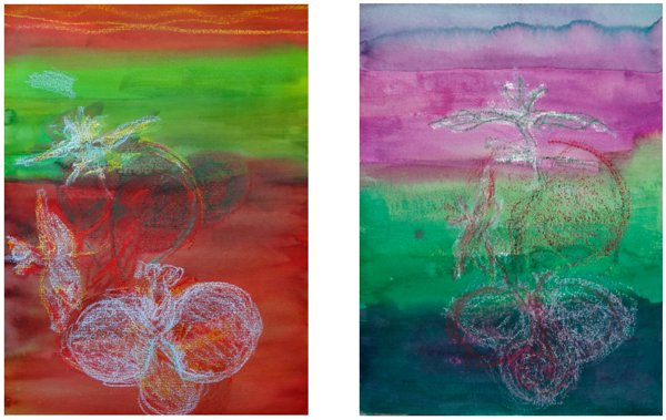
I tried once more taking more time to build up layers this time, from light to dark, adding wax to each layer before subsequent washes. I used fluid water colour for the final wash. I had difficulty in achieving a uniform wash partly because it tended to pool in the paper (220 gsm watercolour paper – lightweight for watercolour – which I had bought primarily for pastels) but also again a tendency to interfere with the wash while it was drying. The background is too vivid – attention is drawn to the violet colour rather than to the subject. I worked ArtBars into the surface in an attempt to counteract the inconsistency and brightness in the surface and also to try to exploit it in an attempt to add depth. The final image is not something that I would hang on my wall but it does have more depth / perspective and structure than the image on the left.
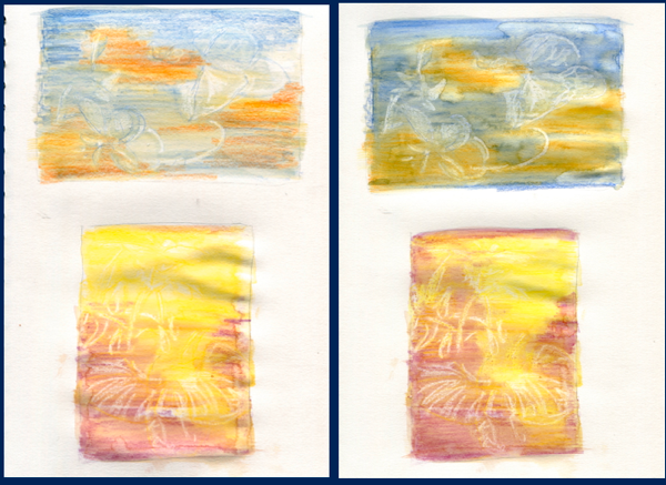
I then attempted two smaller studies in an A4 sketchbook. The paper is thick enough to take a wash and smooth enough to create cleaner lines with wax. Although the lines were not very fine for the scale of the drawings, I liked the ways in which the colours blended and was able to build up tonal contrasts by beginning with lighter tones and layering darker on lighter earlier layers, partially sealed with wax. The two pages below show stages in this process. The images on the right show how the wax resist was used to (loosely) build up parts of the orchid structure.
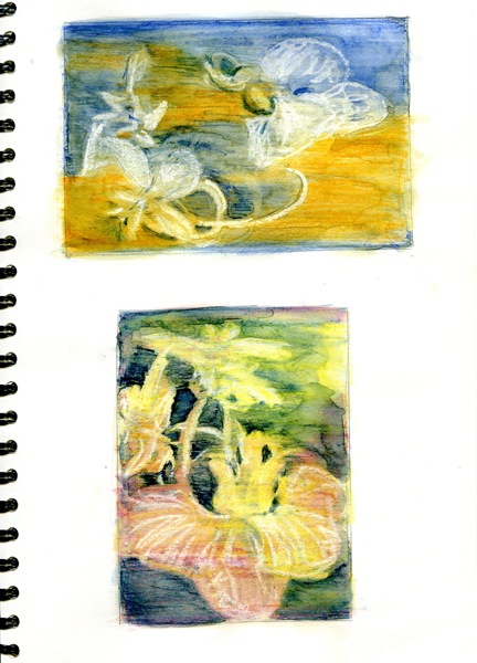
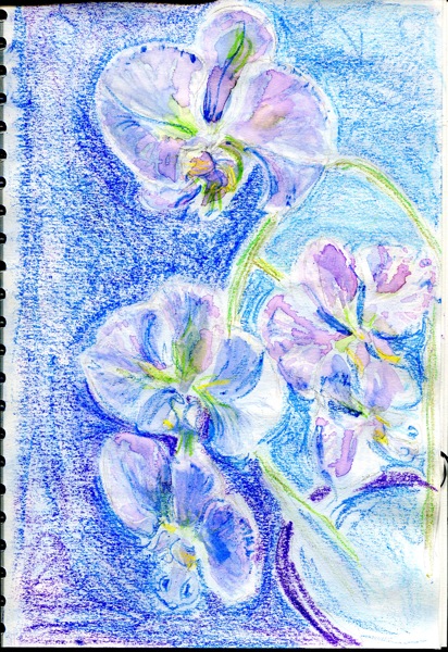
The final images are shown below. They are necessarily impressionistic because of the scale and the tools but I am quite pleased with the colours, contrast and negative space, particularly in the lower image. I used a combination of photo reference and the plant itself.
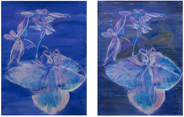
I wanted to create a larger image that I was happy with before moving on to the next exercise. I did some exercises using wax resist to create a single larger image of an orchid flower, seen from above, such as I was trying to capture in all of the previous drawings in this exercise. I was pleased with the way in which the wax and watercolour evoked structure through subtle tonal contrasts in the central sepal. I am frustrated that I can create partial images with which I am happy but that I am seldom content with the whole…
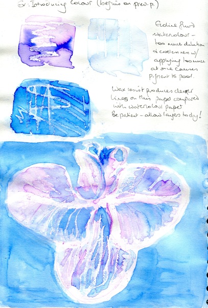
Reasonably happy with the colours and technique, the next step was to put this into practice in an A4 drawing. I drew a loose outline structure in a mauve Inktense pencil, applied lightly. Once again, wax resist was applied using a small candle but also using oil pastels as well. The background was intensified using ArtBars, in order to project the paler flowers towards the viewer.
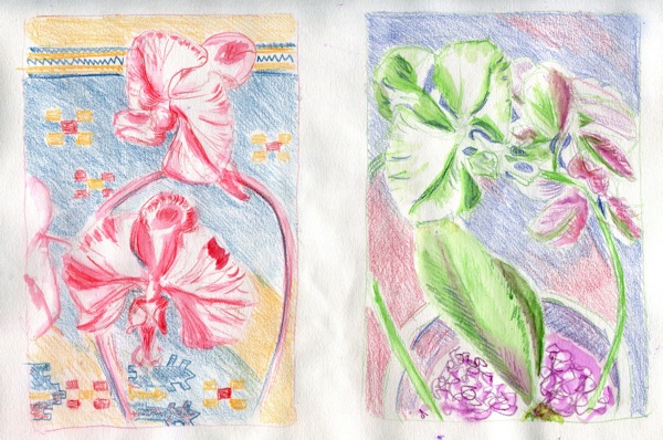
Finally, to get way from the wax resist, I drew two small studies (a single page of A4) using Inktense pencils, with minimal wash. I drew the first one against the abstract background of a woven rug. It is the more successful of the two due to there being more background structure and tonal contrast. The flowers stand out rather more (odd red splurge on one of the petals was an error). However, the second drawing has more movement and uses the space rather better. The intention was to portray the orchid using a limited palette of colours that are not visible in the flowers to any extent in normal lighting conditions.
Reflection:
I am feeling frustrated at this point because of time pressure and a sense that I am not really moving forward with this orchid. In the previous exercise, I felt as if I were “getting to know” the orchid and building on this with subsequent drawings. In this exercise, I felt more as if I were treading water and rushing at things, although I am pleased with some of the smaller scale work. At the moment, I am gathering ideas for a final composition but also feeling the pressure of needing to complete the preliminaries before I reach that stage.
In terms of colour, I feel most comfortable working with complementary or analogous schemes within a limited palette. A limited palette keeps things unfussy and makes it easier to interpret tonal contrasts. The difference that colour makes (for me) is that I tend to draw more impressionistically and rely on the colour to convey a sense of shape and structure rather than paying attention to finer details. The downside of this is that things can get too loose and I can lose sight of what I am trying to represent on the paper.
I would be better to focus on drawing rather than watercolour, and keep washes to the minimum. They work best at the moment as a ground for other media. Now is not the time to work on that particular skill!
I need to explore contexts for the orchid. I prefer the perspective from above rather than from the side but could also explore it from below and consider other grounds or additional objects. I have also not yet explored reflection.
Mark-making: I need to remain conscious of extending my range of marks. In this exercise, this is most evident in the last set of drawings, although there is a lot of fairly random scribble throughout. Marks need to be consciously brought into the design of a drawing and I am not always doing this.
