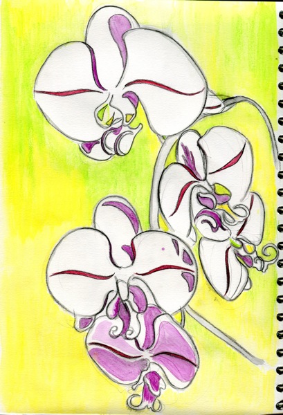
Reworking Assignment 5

The orchid drawing submitted for Assignment 5 required more tonal contrast and I worked on this yesterday.  Specifically, my tutor advised me to address the following:

– work on the edges of the flowers to remove the white paper.

– add marks that describe the surface of the soil

– add more darks to add depth to the image.

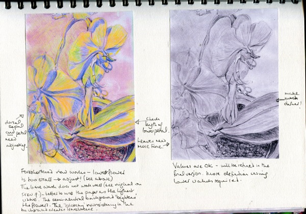
I printed off an A4 copy of the photograph that I had taken earlier of the “finished” drawing and used this as a basis for experimenting with mark-making and tone.  I then scanned in the drawn-on copy and converted both the original and the worked-up image into b&w to get a better sense of tonal contrasts. Here are all four of those images for comparison.  The top row is the original drawing and the bottom row is of the “new improved” sketchbook version.

Screen Shot 2013 05 13 at 21 09 43

Colour differences do exist but the photograph exaggerates these – too much light seems to bounce off the surface of the drawing in the photograph. However, I can see a difference in the “real” images and,  even here, the differences in the soil texture and tone are visible.  The soil is definitely darker and more “soil-like” but the actual soil has more light reflecting off some woody particles so I decided that I would add more light to the soil in the final drawing.  The leaves are also more distinct .  They are tricky because, while being darker in colour than the flowers, they are shiny and reflect the light quite brightly, so do not appear dark at all in direct light.

I experimented with some different textures in the background but was afraid of overworking this. The background has to be just dark enough to project the flowers forward a little towards the viewer but not so dark that it becomes a focal point.  That said, possibly a very dark background is exactly what is required but I am afraid of losing the detracting from the flowers so am not changing this now. Having decided against an intense background (centre right of image), I opted for a lighter ground with a few darker marks creating a loose network in the background (upper left corner)and, through that, a little more depth.

In the final drawing, I added tones under the leaves where the soil is in shade, and where the leaves overlap each other, in stages, checking each stage with a b&w photo until I achieved the required intensity. I am sure that some people would go further with this but courage fails just now.  The final drawing below is not well reproduced but it does give an indication of how the build-up of tone was finally achieved, and also of improved leaf texture – more undulation in their surface. There is more depth now compared with the original image (top) and better soil and leaf texture, with depths within the soil itself.  I have worked on the edges of the flowers, darkening areas of the background very slightly, in order to bring them further forward.  This can be seen better in the actual drawing – this post can only serve to document the process.

The lighting conditions are different but, taking this into account, the extra tone in the final version (below, right) compared with the original drawing (left), is apparent.

Screen Shot 2013 05 19 at 16 24 56

Assignment 5

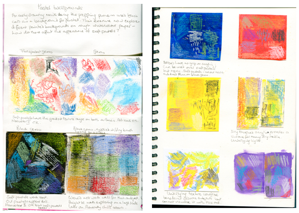
I began the assignment piece by considering the media that I wanted to use.  I had thought of using soft pastels and so tried these against some possible backgrounds (black, white and transparent gesso, blue, red and yellow acrylic paint, black gesso applied roughly over the paper surface, yellow paint applied likewise, and violet ink.  All except the last were applied to a cheapish rough watercolour paper (220 gsm). I had done an early study on black card and liked the way in which the background set off the bright pastels.  However, when I began exploring the coloured backgrounds, I liked the potential for some of these, too.  I tried out soft pastels, Neocolor II crayons, and oil pastels on the various backgrounds.  Crayons and pastels do not work well on thickly applied acrylic but will hold on a surface that has been painted and then wiped to leave a thin, matt layer.

Screen Shot 2013 04 10 at 21 05 31

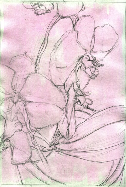
I decided that I wanted to work with a background that was bright but not overpowering. I was also concerned that the underlying colour would affect the colour that overlaid it.  In the end, I decided against the watercolour paper, which was rougher than usual pastel paper.  However, I did not have any A3 pastel paper and decided to use a good quality cartridge instead, with coloured pencils. Initially, I intended to stain the paper roughly with a diluted red-violet / magenta wash. This colour was chosen because it was evident in the shadows on the flower petals.

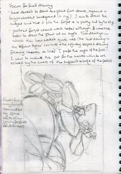
Then, I began to consider the composition.  I wanted to close in on the orchid, bringing it to the edge of the frame, but not to focus on a single flower.  I liked some of my earlier drawings which approached the plant from almost directly overhead.  It created quite an energetic composition and avoided the problem of “stranding” the plant in the composition.

Here are two initial sketches of the idea:

Img417

Img418

This second composition was too far from the viewer.  I needed to get closer until I was practically sitting on top of the orchid.  The next sketch formed the basis of the final composition, with some later tweaks for proportion.

Img412

I was happier with this composition, although saw that it required a few adjustments, notably to the flower bottom left, which is too small. Getting the angles right was tricky, not least because holding a constant position was difficult.  I placed a meter ruler in front of the pot and used that as a horizontal reference for all of the angles, lining my pencil up against it every time I needed to judge an angle. I also placed post-it notes on the floor where the edge of the front legs of the chair should lie.  I tried to ensure that I sat straight so that the angle didn’t change but this was challenging and I am not sure that I fully managed it. Adjustments were made to this composition, which will show up later in the A4 grid used to scale up to A3. 

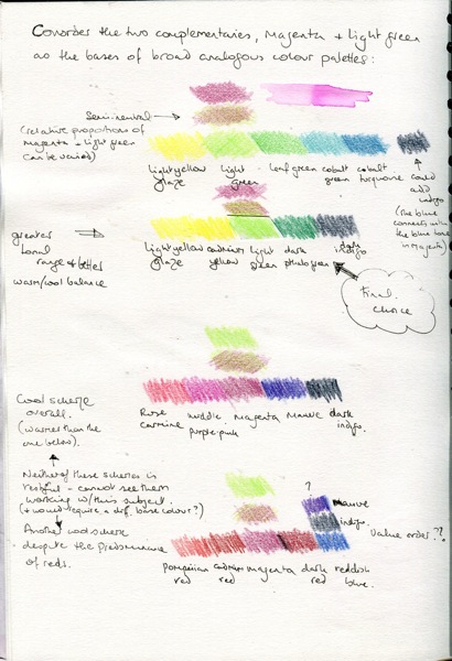
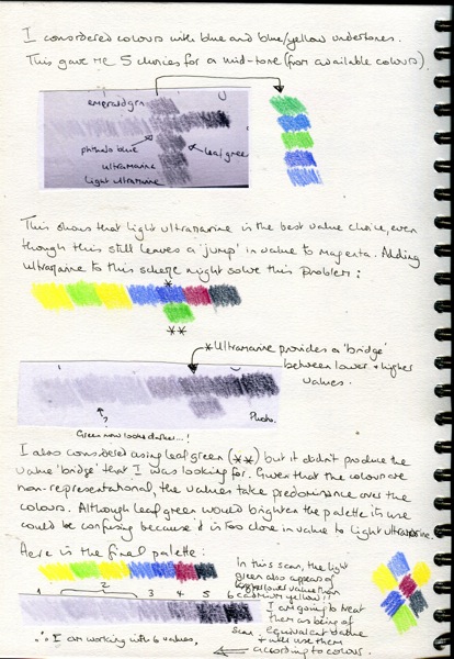
The next stage was to select a palette.  I thought to use a limited palette of analogous colours, although the spread chosen is a little wide to be considered analogous.  Having selected a red-violet / magenta background, the palette had to include this.  Light green was chosen as the complementary colour (in order to produce some neutral shades) and the rest of the colours were chosen to harmonise with the green, as well as produce a spread of values. The process was documented over four sketchbook pages:

Img405

Img406

Img407

Img411

This process was lengthy because I cannot yet easily relate colours to their values but black-and-white photographs helped and, eventually, a palette was selected that represented a range of six to seven values, although I have read somewhere that it is a good idea to use no more than five. The cadmium yellow and light green were very close together and sometimes one of them showed up as being of higher value, and on other times the other.  In the end, I treated them as being of approximately the same value but decided to include both for their colour, as much as for the value they represented.   The final palette in order of lowest to highest value was: light yellow glaze, light green / cadmium yellow, light ultramarine, ultramarine, magenta and dark indigo.  The pencils were Faber Castell watercolour pencils (although I did not in the end use a wash, I wanted the flexibility to include one at a later stage).

I then printed off a copy of the scanned drawing above (before adjustments) and tried out the palette. I was satisfied with the colours.  I tried to suggest the rough texture of the soil with abstract marks using the colours with the lowest value.  The wash seemed slightly dull to me, possibly because its use prohibited the use of the white paper for the highest value.  Therefore, I decided to abandon the wash and use plain cartridge paper.

Img413

The next stage was to check the values in the drawing above, which was achieved using a black-and-white photograph.  The monochrome image below shows that there are not enough darker values in the flowers themselves: there needs to be more tonal contrast – I need to be braver with the lower value colours. The soil worked quite well, though, and I decided to include this in the final drawing.

Img419

The next stage was to make some adjustments to the basic drawing in the A4 sketchbook and then to print this out and superimpose a grid onto it.  The drawing below was then scaled up on to A3 cartridge paper.

Img420

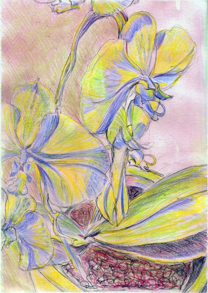
The final drawing took 5-6 hours in one main session – with a break – followed the next day, by a further hour or so after checking the values.  In this second session, I added some darker tones to produce more contrasts and a better spread of values.  Using the white paper as a background proved better than the red-violet wash.  However, it would be interesting to compare this subject against other more dramatic backgrounds, such as the yellow or black.

The drawing was photographed under artificial lighting and is too large to be scanned. When it comes back, I will have another go.  Efforts at enhancing the image digitally produce a garish yellow colour in the flowers so I have foregone this.

The drawing is not as pale as it appears here but the colours are fairly delicate.  I decided that, given that the plant is clearly situated in the pot, that this was context enough and to add an abstract rug design in the background would be to detract attention from the flowers so I have kept it simple and neutral.  The addition of indigo to the light green / magenta semi-neutral shades has helped to project the flowers towards the viewer. I am generally pleased with the shape and movement of the flowers themselves, especially the main one on the right. I like the lines of the flowers, which echo the support and the pot; the eye is carried around the composition.  Coming in close and bringing the composition to the edge has heightened the energy and produced a largely unfussy drawing which is recognisably orchid-like.  I was aiming at a degree of realism, although the colours are not intended to be realistic.  There is a sense of the whiteness of the flowers, even though white only appears as an accent where light is reflected from the surface.

DSC00471

The image is a bit clearer in black and white.  I am pleased with the values in the flowers, which resemble the texture of orchid petals. The upper leaves are still not dark enough.  Unexpectedly, this was the hardest part to judge.  The leaves are deep green but lustrous.  In places, they reflect light, notably at some edges and around the central vein; my drawing could show this more clearly. I am also pleased with the foreshortening, which has worked quite well.  I could not have done this six months ago.

DSC00465

Drawing with Line – further explorations

While working on the recent Research Point concerning line, I had some ideas that I decided to explore in the context of my orchid.  These are summarised below:

1.  After Klee.  The first of these was to take a line for a walk.  It is quite tricky to keep a drawing tool on the paper continuously, especially as you must think ahead about the route that the pen will take. I found this too much for the first attempt and so this is actually three or four separate lines.  The top flower appears more rose-like than orchid-like but the line is fluid and the plant has some life, while not being life-like.

Screen Shot 2013 03 10 at 13 03 51

2.  After Vaslaw Nijinsky.  Nijinsky produced a number of abstract drawings, many of which reflect the movement of dance. Nijinsky turned to art once schizophrenia had been diagnosed and his dancing career was at an end. Leowelzin’s Weblog has an entry on Nijinsky’s abstract works (in German but with many images).  The energy in some of these images caused me to wonder how the movement in a work inspired by a dancer in perpetual motion could, in turn, help to convey the imperceptible movement of natural growth in a plant.  The partially abstract A4 drawing that has resulted is a product of play more than skill but has helped me to perceive the growth habit of the orchid rather better and has begun to cross the boundary between line and tone.

Img372

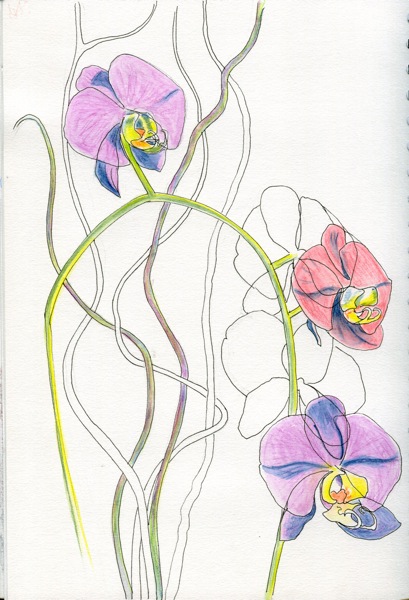
3.  After Charles Rennie Mackintosh.  I very much like the transparency in Rennie Mackintosh’s flower watercolours.  He creates depth in his paintings by allowing the structure of the plants – petals, stems, leaves – to show through, creating additional visual interest and complexity in his botanical images.    Some of his paintings contain more “bare” structural elements than others, which might be perceived as being less finished but which I prefer for their contrast and somewhere for the eye to rest.  I attempted two drawings in this style. Rennie Mackintosh’s best watercolours contain a variety of flowers, offering contrasting shapes and structures. I found that an orchid alone offered few opportunities for overlapping structure and variety so I included a bunch of hazel twigs, which I like for their twisting, fluid lines as well as their strong verticality.  I used a fineliner, Inktense pencils and wash.

Here is the first drawing:

DSC00239

The composition is naturally strongly vertical and doesn’t really work on conventional sizes of paper (drawn on A3 and image then cropped to eliminate an expanse of white paper).  Here is a crop of the flower detail.  That the twigs reach the edge helps to draw the viewer into the flower mass.  However, I felt that there might be a bit too much structure here – the image is too fussy.  I was uncertain about the intensity of colour – the underlying structure has to show through and it is the delicacy of Rennie Mackintosh’s flowers that attract me.  The lines are too thick here, even for a fineliner!

DSC00240

I made an attempt at simplifying the image while retaining enough structure for interest.  After drawing the flowers themselves, there was too much negative space and a few hazel twigs were added to balance the composition. I used a finer pen for this A4 drawing, which has resulted in cleaner lines.

Img369

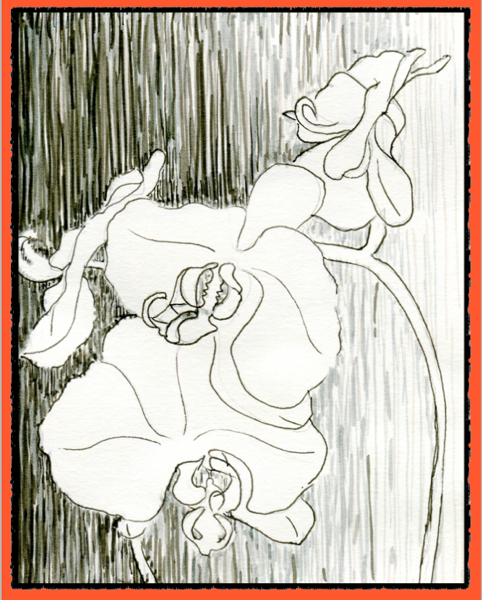
One further exploration was not directly influenced by any of the above but came from a consideration of using line to reverse positive and negative space.  I created a stencil from an earlier drawing and used grey and black marker pens to create a background.  This threw the flowers into the foreground but, with an absence of structure, it didn’t work.  I considered the possibility of introducing subtle areas of tone using soft lines in a similar way to the background but was not sure how this would work – to be effective, surely the lines should follow the growth direction of the petals, which would contrast (or compete?) with the lines in the background?  I could not visualise how this might work and so it remains something to try out in the future. However, the flowers did need some structure so a fine liner was used for this.

Screen Shot 2013 03 10 at 13 38 46

Overall, working in line has focused my attention on movement, angle and perspective and has brought me to the point where I am ready to explore tone.

Further sources:  While I have some concerns about the use of images on Pinterest, it can be very useful – as in this collection of Rennie Mackintosh flower paintings.

Drawing with Line

For this exercise, the aim was to use line to “observe closely the crucial structural lines that outline shape and suggest volume and texture”.

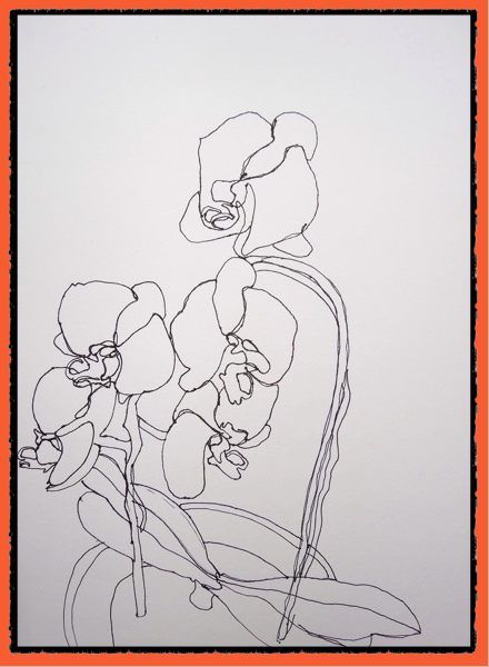
I began by drawing blind contour drawings, of which the first two are below. Kimon Nicolaides in his book, “The Natural Way to Draw”, describes a contour drawing as “like climbing a mountain as contrasted with flying over it in an airplane.  It is not a quick glance at the mountain from far away, but a slow. painstaking climb over it step-by-step” (Nicolaides, p.11).  Nicolaides said that we should allow our eyes to move at a slow, steady pace around the subject, keeping our eyes on the subject not the paper.  I find that this requires an almost meditative, trance-like state to succeed and, therefore, only works in a relaxed state of mind without the “to do” list running through the back of my mind.

I have adopted a method that I read about on Access Art (link here but it might require membership for full access) which essentially involves taking a piece of cardboard and make a hole in the centre for your pencil. The card should be slightly larger than your hand when in a drawing position. This makes it impossible to see what you are drawing and so it isn’t worth peeking!  I find that this aids focus.  It takes a bit of getting used to and it can help to tape the card into position so that it is not actually resting on your drawing hand.

The drawings below (in an A3 sketchbook) were made in a relaxed state of mind using the cardboard.  I began at the top of the plant each time and drew in a clockwise direction.  This is clear in the drawing on the left in which I overshot the starting point.  I found it difficult to maintain pressure – or perhaps it was due to changing the angle of drawing with this particular pen. I am very pleased with the one on the right, which was almost spot on.  I then added some negative spaces and stalks to convey some sense of structure.

260220131808 1

Because the course notes refer to making “several studies” in this way, “spending only a few minutes on each one”, I thought that I should do more.  This time, I chose a different angle, more directly above the plant and began on the left-hand side.  The blind contour drawings below were done a few days after the ones above and were done in less time and in a different mind set – and it shows!  I have no doubt that this is something which should be part of daily drawing practice if skills are to develop but, for me, a blind contour drawing requires a slow, meditative approach if I am really to see the subtle changes in the edges.  Plants and other natural materials, in particular, often have softer, more rounded edges which present particular challenges if the hand is to accurately follow the eye around them.

Most of the drawings below have the same fault, however: I shifted too far over horizontally to the left towards the finish so that when I approached the starting point, there was not enough space. This is particularly apparent in the drawing on the far right and it seems to have become a worse problem with each attempt (4 drawings from left to right – the plant becomes skinnier each time!), suggesting that I was trying to over-compensate in some way. I gave up at this point because of lack of focus.

260220131807_1

My next blind contour drawing was done in an A4 sketchbook.  I attempted one flower only with an Inktense pencil and then played around with wash to add structure. As this was not the aim of the exercise, I had another go with an HB pencil.  I overestimated the line at the top of the flower and then added detail in the form of connecting edges and further modified the lines using a light sepia conte pencil to try to get a better idea of the overall form.  It is a mess but it has made me more aware of the top flower which leans back away from the viewer and this has different impacts on drawing, depending on the viewing angle.

Img364

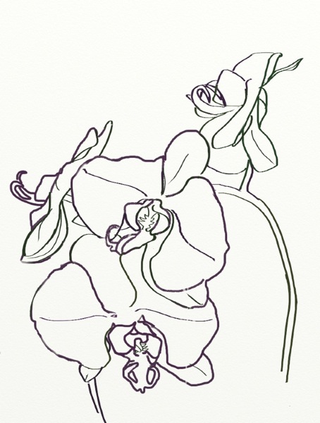
My last attempt at a pure contour drawing was done using Sketchbook Pro on an iPad.  I couldn’t resist some structural special effects!  I’m quite pleased with the flower at the bottom, as well as the overall contour although the contour is too defined and harsh for the more delicate flowers, which were not planned. Not sure why I didn’t add negative space – presumably there should be some from every angle in this plant.

Photo

I was now ready to use line in a more detailed structural way. The drawing below was done in an A4 sketchbook.  I was aiming to show direction and movement in the petals, as well as to suggest internal structure within the flowers themselves, although this scale is not large enough to do more than give an abstract suggestion of such structures.  I paid attention to negative space as well as the angles of petals on the flowers, all of which are facing different directions.  I reinforced edges closer to the viewer with a 3B pencil to help convey direction and spatial interrelationships,

Img365

When I attempted a different angle, again I used the iPad, this time using Art Rage. This was the first time of using this particular app and I found that the pen colour tended to change randomly when I switched functions and was not easy to change back exactly.  Therefore, this is a (at least) two-tone drawing, which I quite like and would be worth pursuing in a more controlled / planned way.  I am beginning to get movement into the flowers.
Photo

At this point, I thought that I should learn about the anatomy of an orchid, so that I would have a better understanding of the individual structures as well as their relationships to each other. The structure that opens out at the bottom is called the lip, and it is technically also a petal.  The other petals are the two wide “wings” either side of the centre.  The three narrower petal-like structures are actually sepals, whose job is to protect the flower in the developing bud.

For the last couple of line drawings, at this stage, I decided to zoom in on the colourful internal structure which contains male and female parts of the flower (known as the column). Even with line alone there is more opportunity to convey structure and texture here because of the crimson striations which follow the undulating form of the column.

I used a magnifying glass to get a closer look.  This was not intended to be a botanical illustration, more of an investigation using line.  It proved awkward because I have no way to set a magnifying glass into a permanent position in front of the flower, which meant that I was constantly bending forward to peer at it and then sitting back to draw.  Here is the flower under the magnifying glass.  This photograph was taken with one hand on the magnifying glass and the other trying to operate the camera on the phone so the angle is not exactly the same as that in the drawing which follows but it gives an idea of the subject.

260220131813

Here is the drawing that resulted.  It is approximately half of an A4 sketchbook page.  The internal markings create the first texture that I have consciously produced in this exercise.
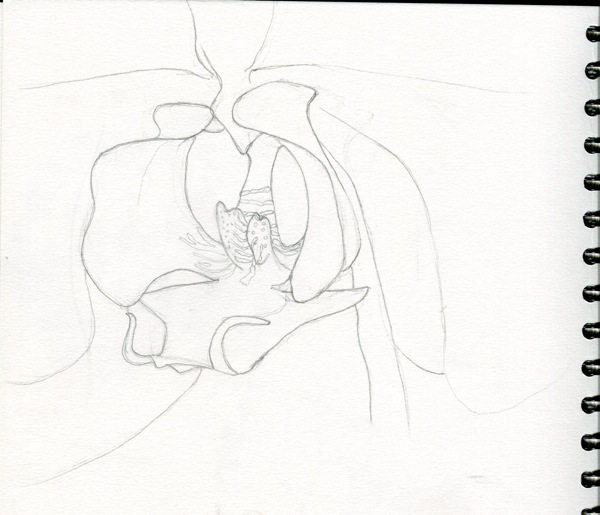
Img366

Because it seemed a bit cramped on the page, I repeated the exercise from a different angle in the A3 sketchbook.  The scale is such that, if I wanted to reproduce it and include an entire flower, I would need to use at least A2 paper.  This has implications for composition.

270220131815 1

Somewhat surprisingly, the scale of these drawings is not too different – it is the angle in the A3 drawing (the plant was on the floor with the flower slightly tilted upwards, compared with the plant standing on the coffee table and the flower more or less at eye level) which makes the flower appear larger.  The level of detail is much the same.  The angle creates a totally different feeling / mood – looking at the plant head on creates a more confrontational image, somehow (but it is only an orchid, not a triffid).  Here are the two drawings photographed together.  I have used lines to denote edges of planes where tone would be a better choice because of the nature of the exercise.  I had to adjust the width of the stem because it did not look strong enough to support the flower. It should now be to scale.
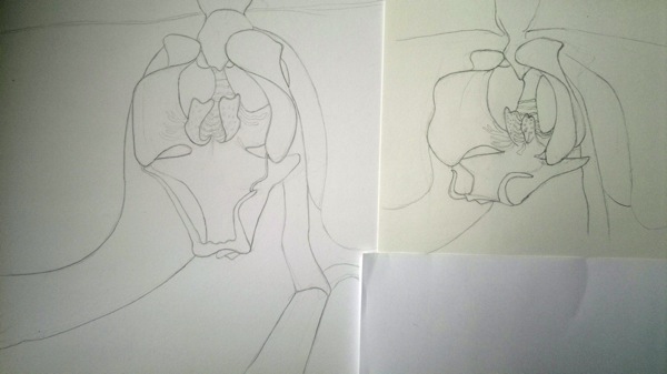
270220131818

In none of these drawings in this exercise have I provided a context for the orchid  (“rooted the plant”), which is partly because I have been focusing on the flowers but also partly because I have often used A4 paper and cannot achieve a desirable level of detail as well as the entire plant on this scale.

Sources:

Nicolaides, Kimon (1941) “The Natural Way to Draw”. Houghton Mifflin.

Postscript: I remain concerned that the orchid will stay in the land of the living for the duration of this assessment. I have just signed up for a “watering reminder” on http://justaddiceorchids.com – apparently 3 ice cubes a week is all that is needed to keep an orchid alive. At the moment, I am giving it a 10 minute soak once a week. I have had it for two weeks and it still looks healthy, although now minus its buds….

Many links on orchids for future reference:  http://www.orchidmall.com/reading.htm